DMVbazaar
Persian & Middle Eastern grocery website design

Project
DMVbazaar

Role
Research, Interaction

Duration
12 months (part-time)

Tools
Figma, Photoshop
Project Overview
DMVbazaar website provides Persian& middle eastern products for:
DC, Maryland, and Virginia Residents.
Problems
- Many Persian stores have limited products.
- Finding some special products takes a long time to find.
Research

Survey & Interview
Conducted with 30 users

Competitive Analysis
Analyzed 16 Competitors
User Research Summary
User pain points
1. More Organized product categories
-
Solution
Card sorting for categories
A/B testing
2. Lack of English knowledge
-
Solution
Providing products names in 2 ways:
English and “Finglish” search (Farsi with English characters)
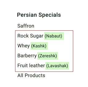
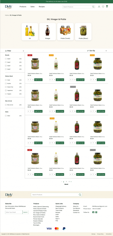
3. Poor Filtering
-
Our Solution
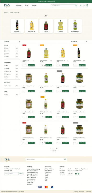
Providing dietary options in the left side Filter
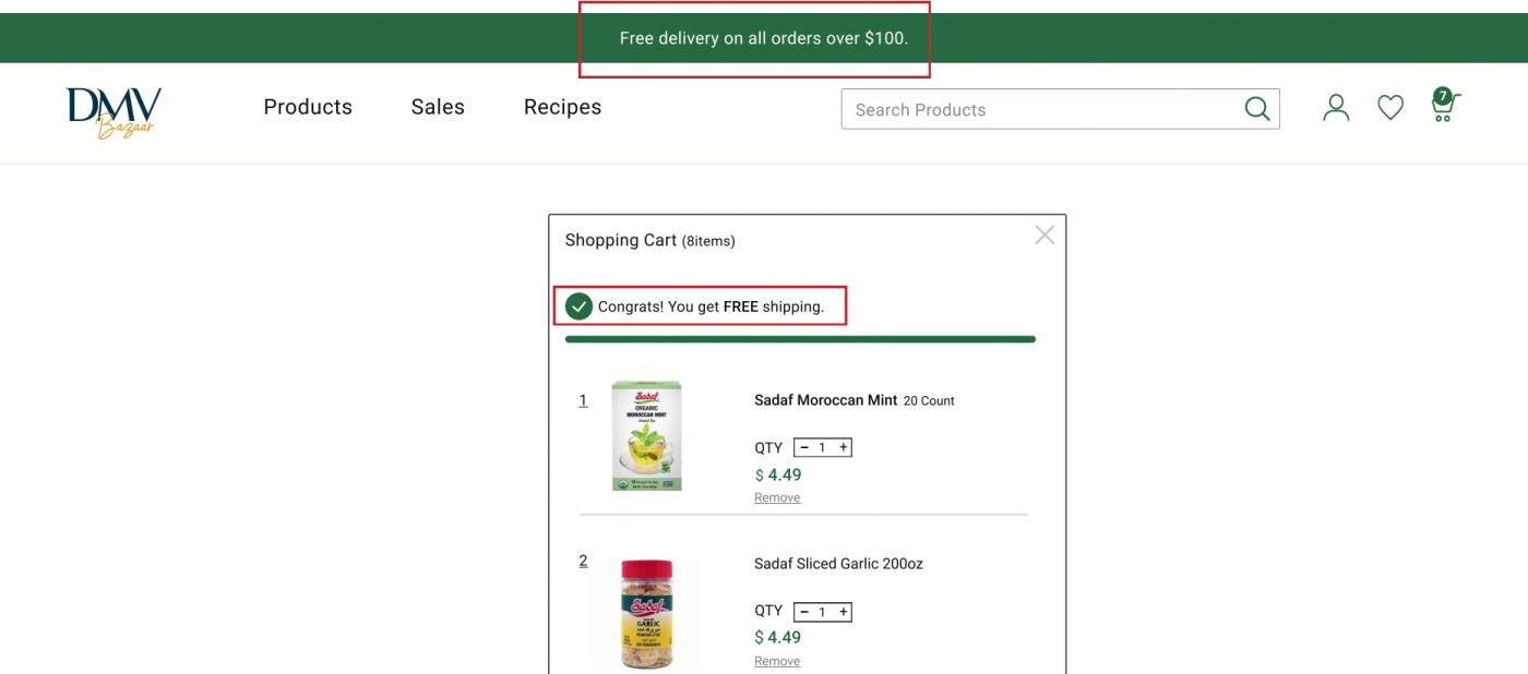
4. Lack of shipping service information
-
Our Solution
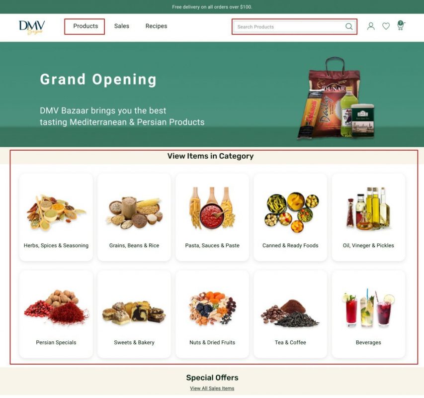
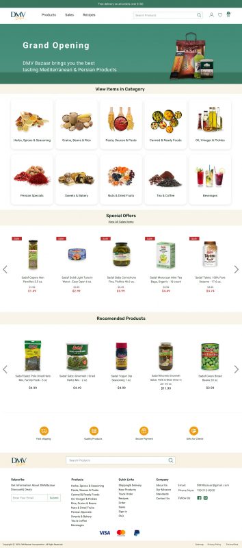
Displaying free shipping on top of the home page and Shopping cart
5. Seeing sales and new products in first look
-
Our Solution
Displaying new product and sale sections in the home page
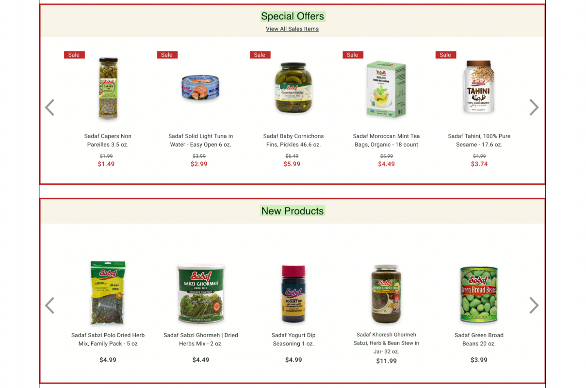
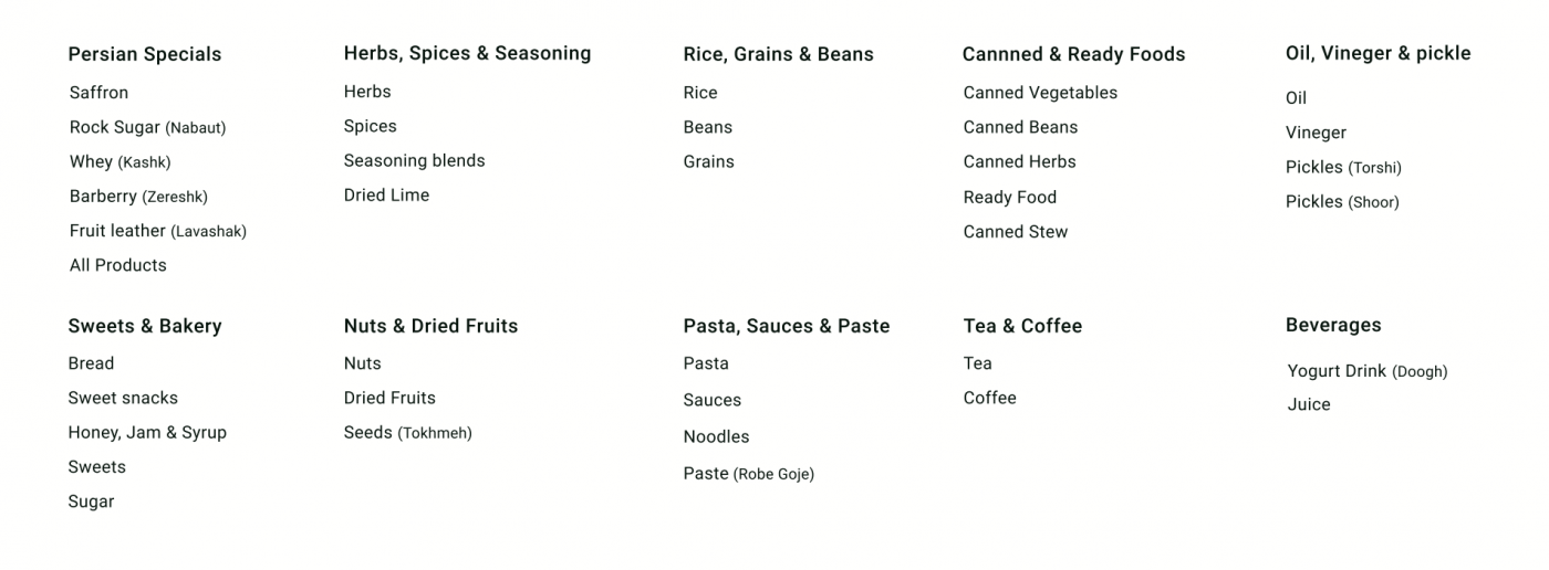
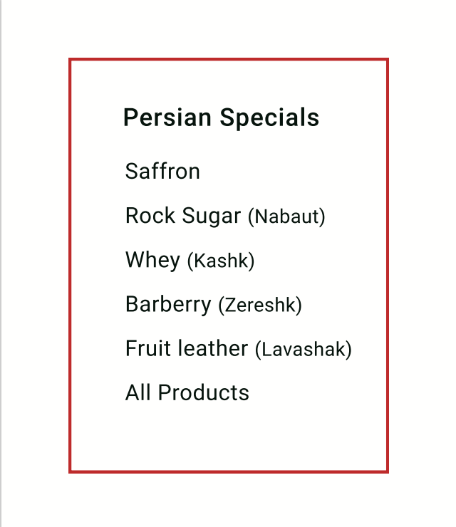
6. Difficulty in finding some special Persian products
-
Our Solution
Providing individual category titled “Persian Specials”
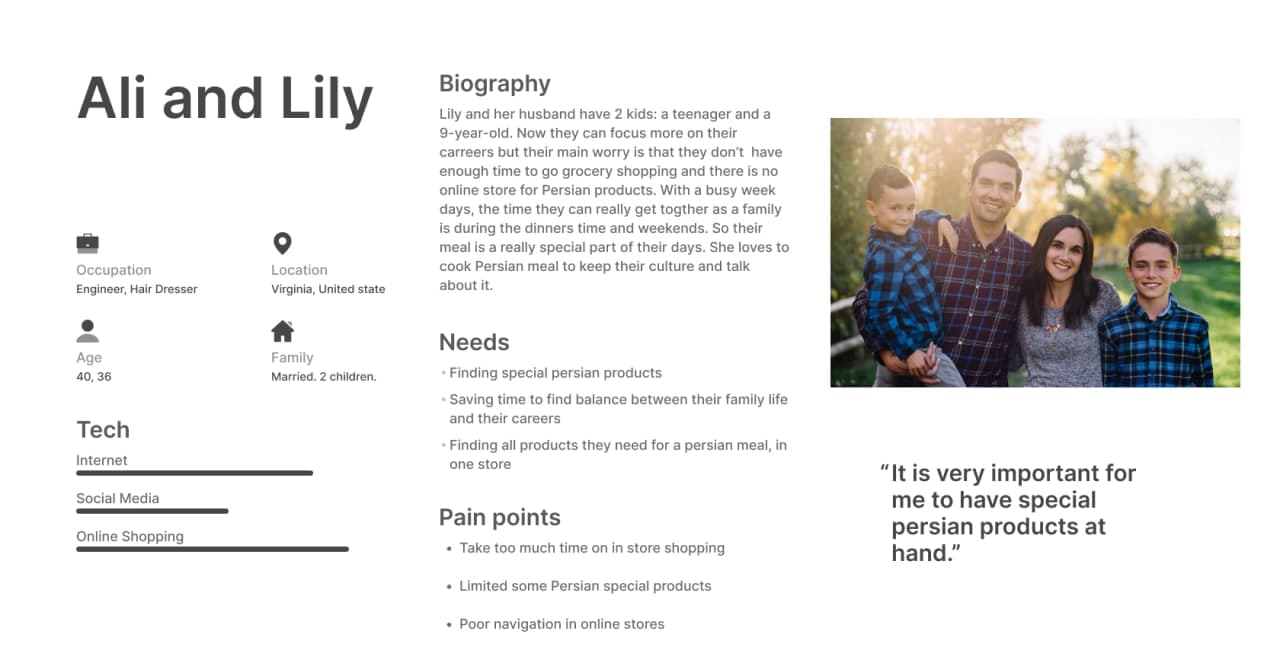
Persona
Competitive Analysis Result
We looked at several online Persian& Middle Eastern Groceries, The main differences that we noticed were.
- Minimal Design
- Included Green color pallet
- Recipe section
- Poor Category
Key Challenges
1. User flexibility to find the product
- Our Solution
There are 3 ways to find a product
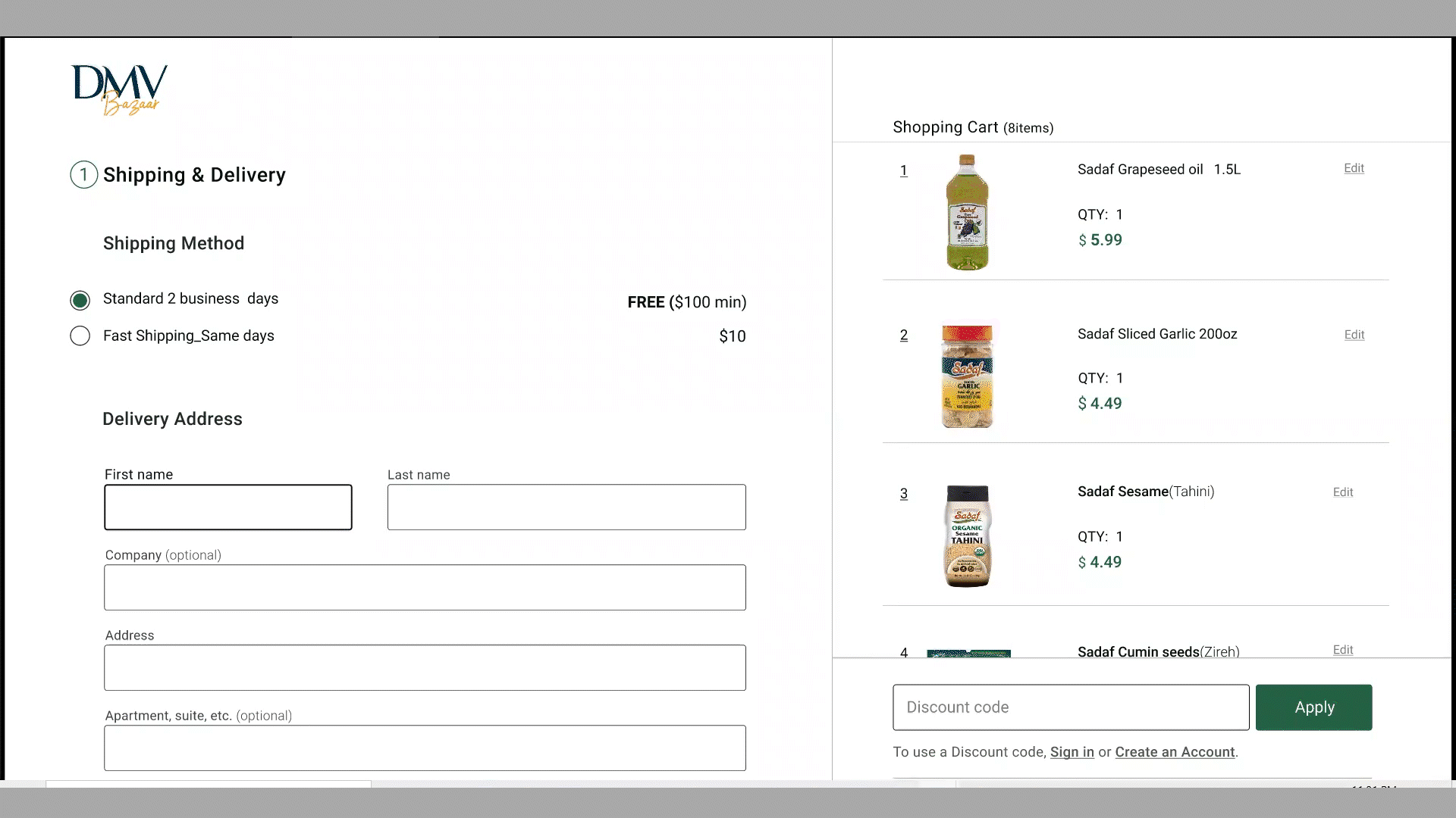
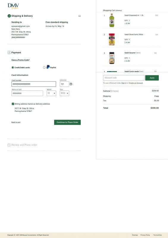
2. Convenient Checkout Process
- Our Solution
The Checkout process is designed in one page. we created a vertical Progress Bar in order to make an easier way to confirm each process when it is done.
Design
Wireframes
Home, Category, Product pages
Checkout process
Key wireframes
Home page
Category page
Product page
Sub-Category page
Checkout Process
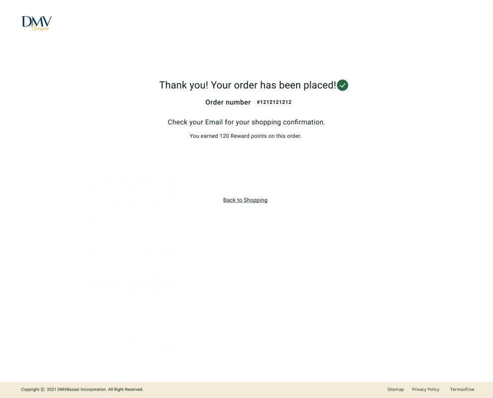
Confirmation page
Usability Study

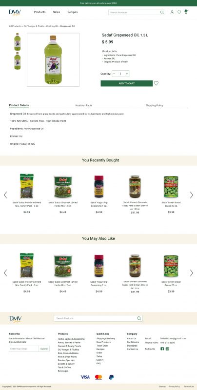
A/B Testing
Quick buy option

Main Task Usability Test
Find and Purchase product
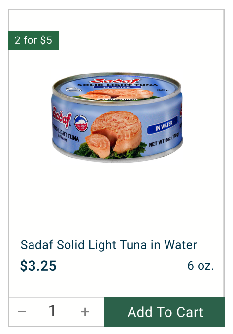
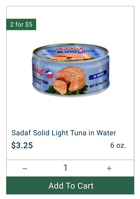
A/B Testing
Conducted A/B test with 30 users to compare 3 versions of
“ADD To CART” button and “Quantity” options
A
B
C
Usability Test Measurement
12 users completed the task, and were asked to answer a quick survey due to the measure of the success rate;
12/12
All users able to easily complete the desired task
12/12
All users would use this website frequently.
11/12
In opinion of the most of users the design
of this website is integrated
11/12
Working with the website was easy to use
and doesn’t need any guideline