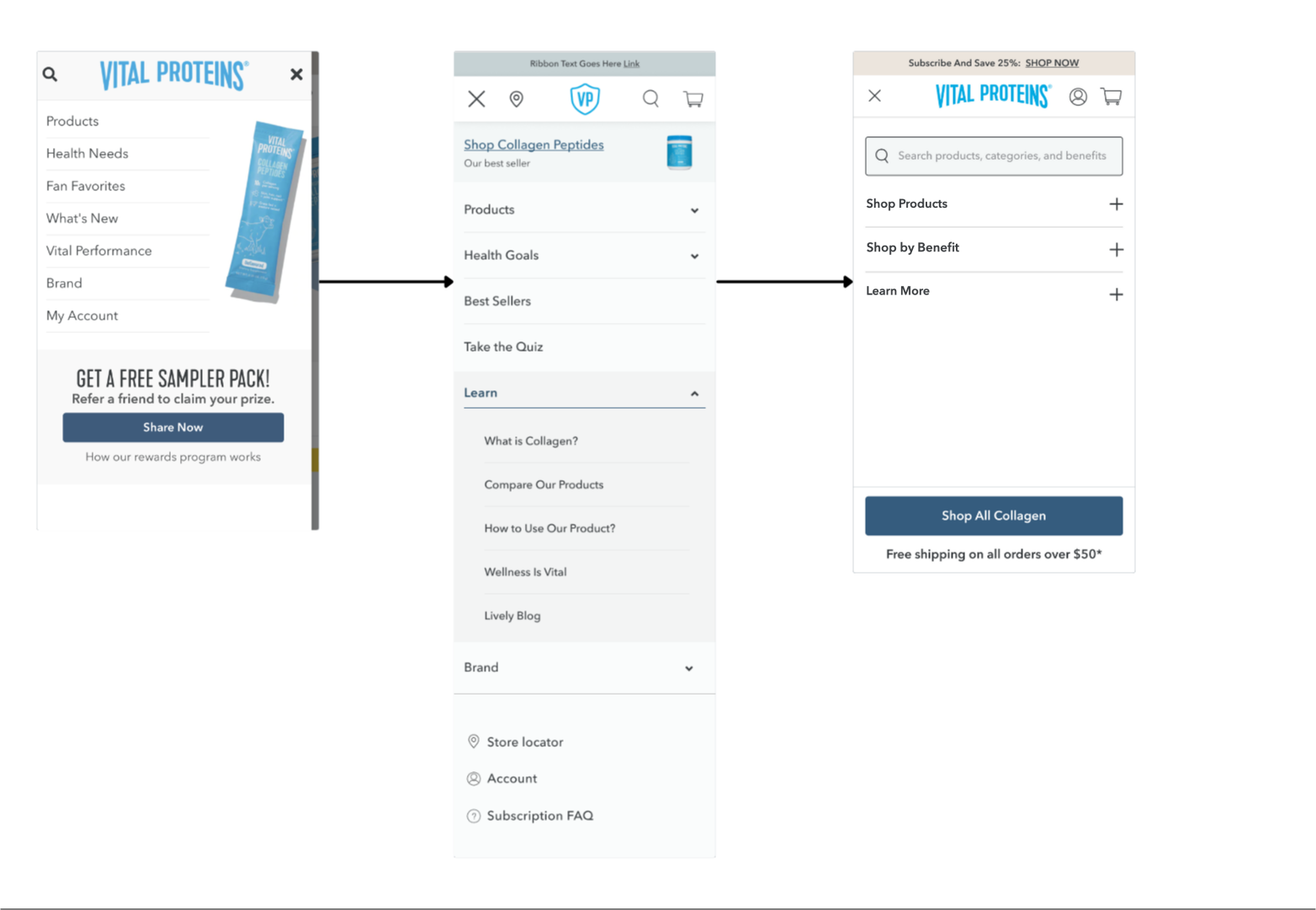
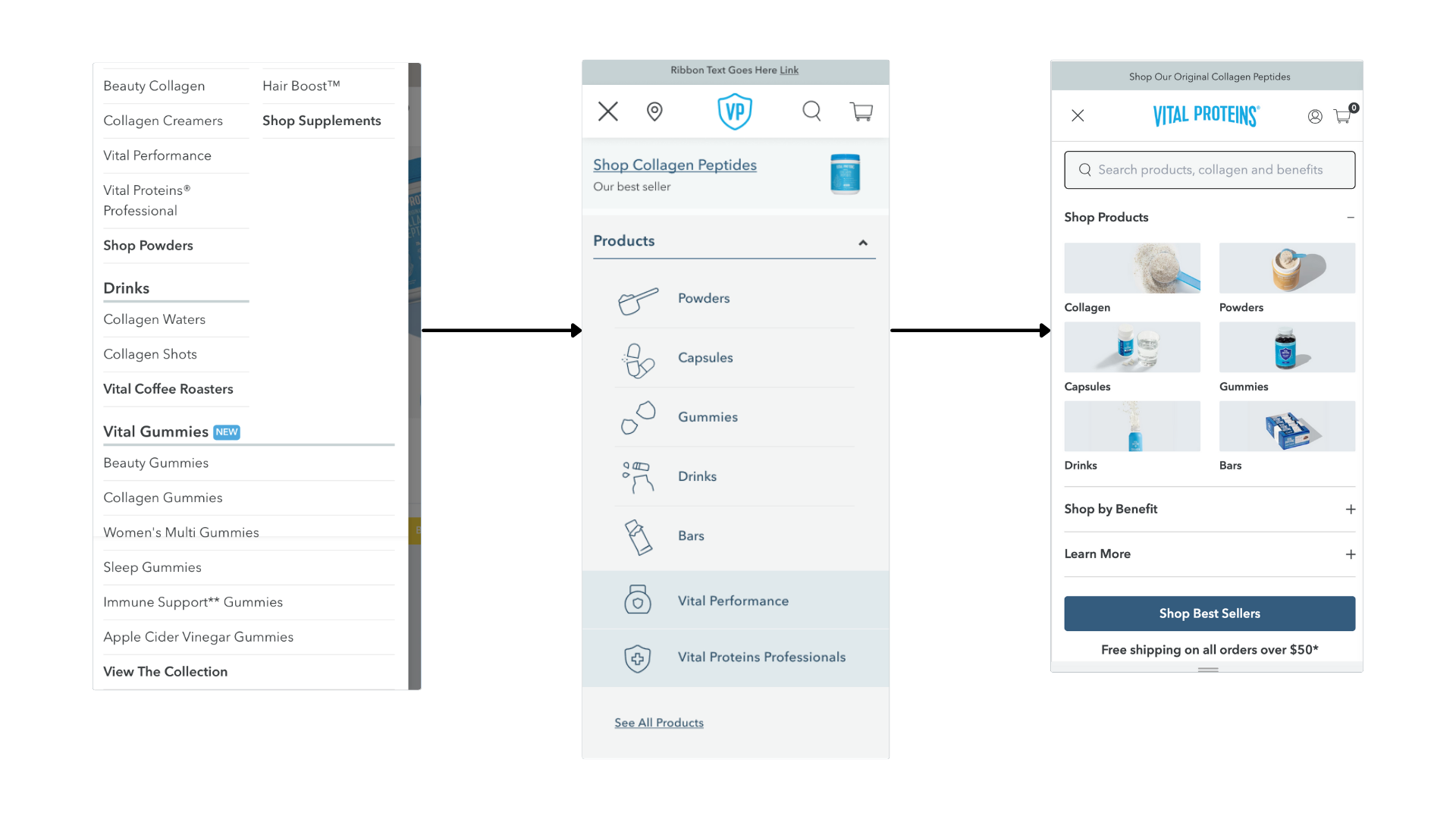
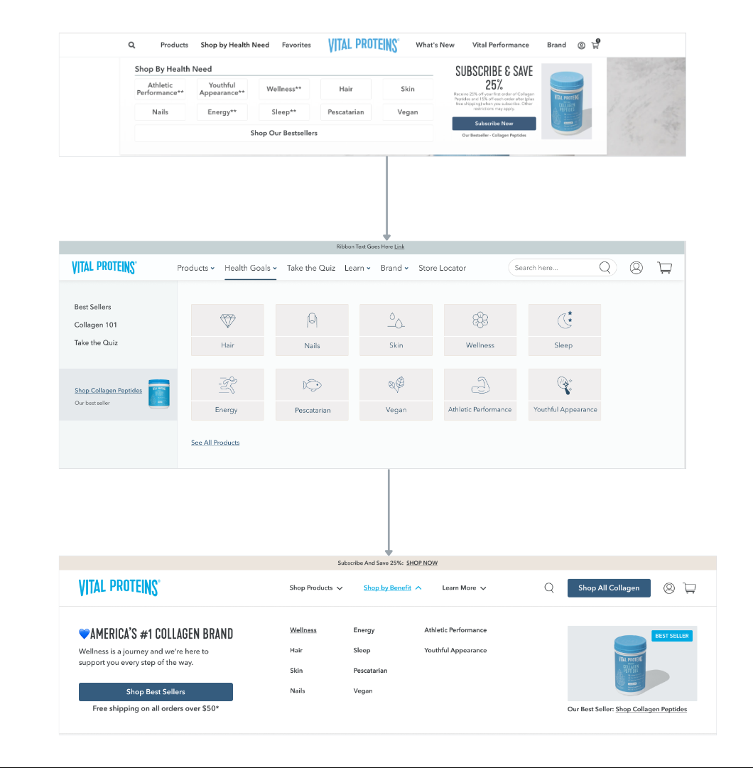
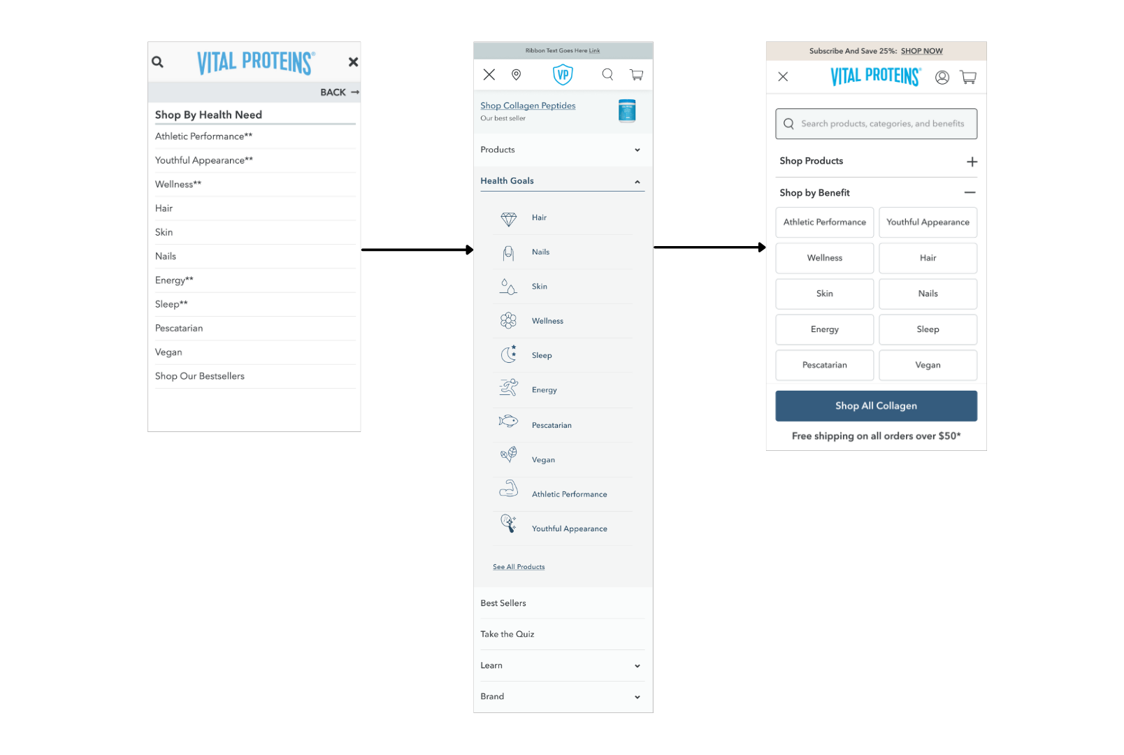
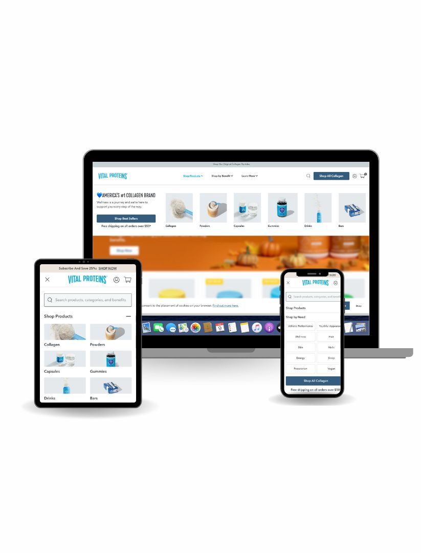
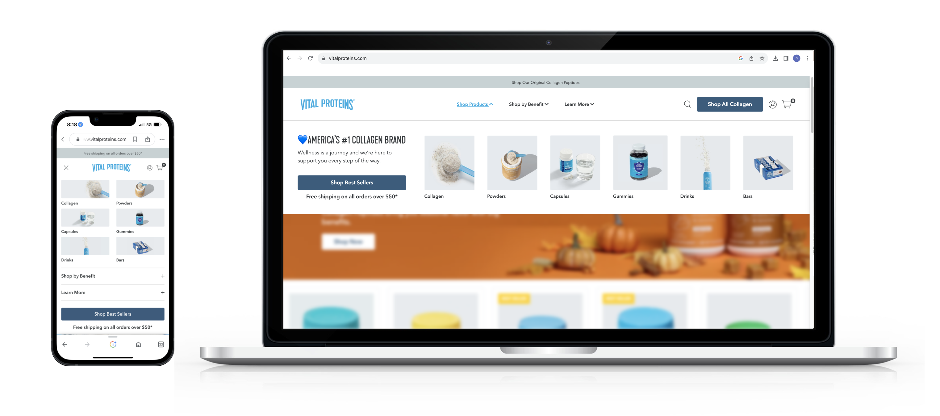
Main Navigation Redesign
The primary website navigation/menu has been updated to give customers a more simplified path to purchase and an improved product-exploration experience.
The primary website navigation/menu has been updated to give customers a more simplified path to purchase and an improved product-exploration experience.

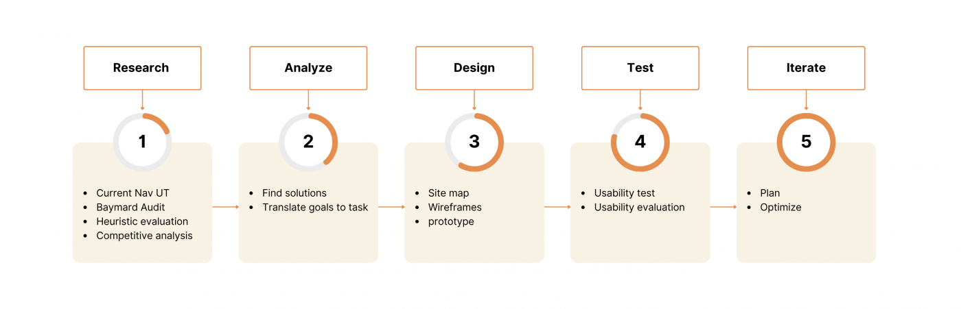
Leading the entire design process including User research, Wireframing, Usability testing

Figma, UserTesting

9 Months
The main website navigation/menu has been redesigned to simplify the path to purchase and enhance product exploration. This expands the company’s reach and aligns with two key DTC objectives:


+31.6% Increase in purchase rate
+10% Increase in the customer journey from HP to PCPs on mobile devices
- Well-organized menu
- There was a lot of interest in image with text
- A simple navigation system
- The design is clean and minimalistic
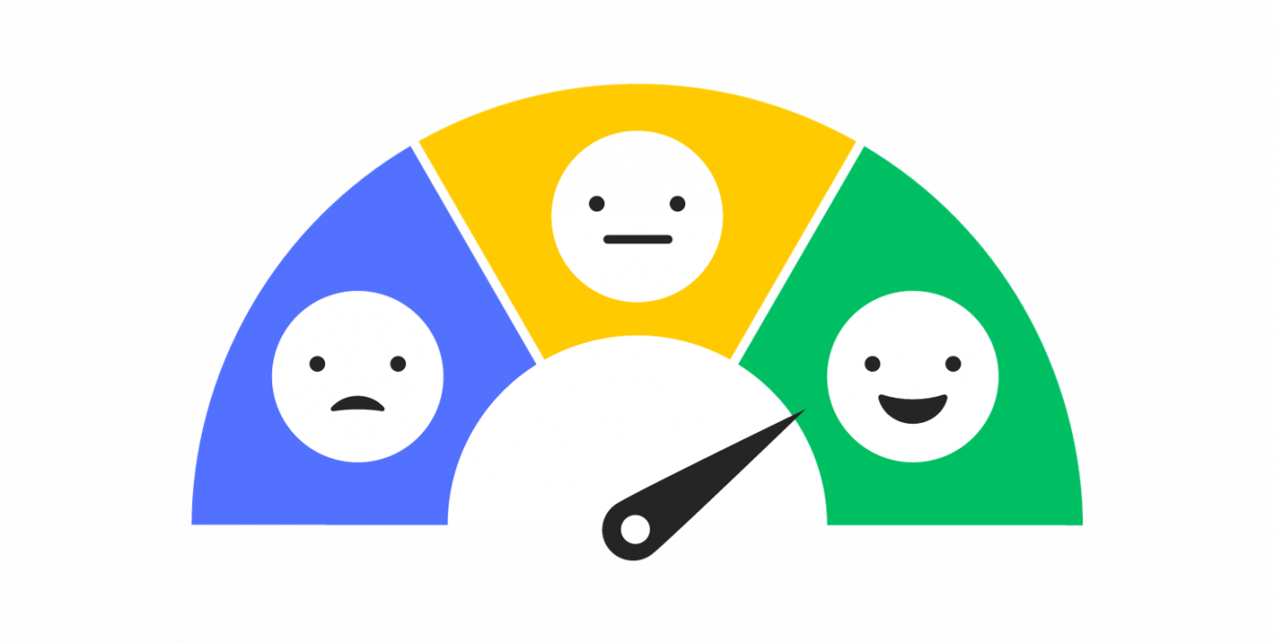
The current state of our website presents several significant issues affecting user experience and engagement:
User Frustration (Content Square): Users are experiencing frustration when interacting with our website, which is negatively impacting their overall experience.
Low User Engagement (Google Analytics): Our website is suffering from low user engagement, suggesting that users are not finding the content or features that captivate their interest.
Baymard Audit Score: Our website’s Baymard audit score is lower compared to other e-commerce platforms, indicating that we lag behind industry standards and best practices in providing a seamless online shopping experience.
User Confusion (User Testing): User testing has revealed that our website is causing user confusion, particularly in the process of finding products or information necessary to complete a purchase.
“As a user, I can’t easily find the product or information I’m looking for to complete a purchase, resulting in user frustration, low engagement, and subpar performance compared to other e-commerce platforms.”
Solving this problem is essential to improve user satisfaction, increase engagement, and enhance our website’s competitive position in the e-commerce market.
Reduction in on-site search utilization (because people can browse easier)
Bounce rate on pages clicked from navigation (because users can more easily find what they are looking for)