Oval Air Website Redesign

Transformed Oval Air’s website into a conversion-focused eCommerce platform with clear product storytelling, a new subscription model, and a refined UX/UI

Project Overview 

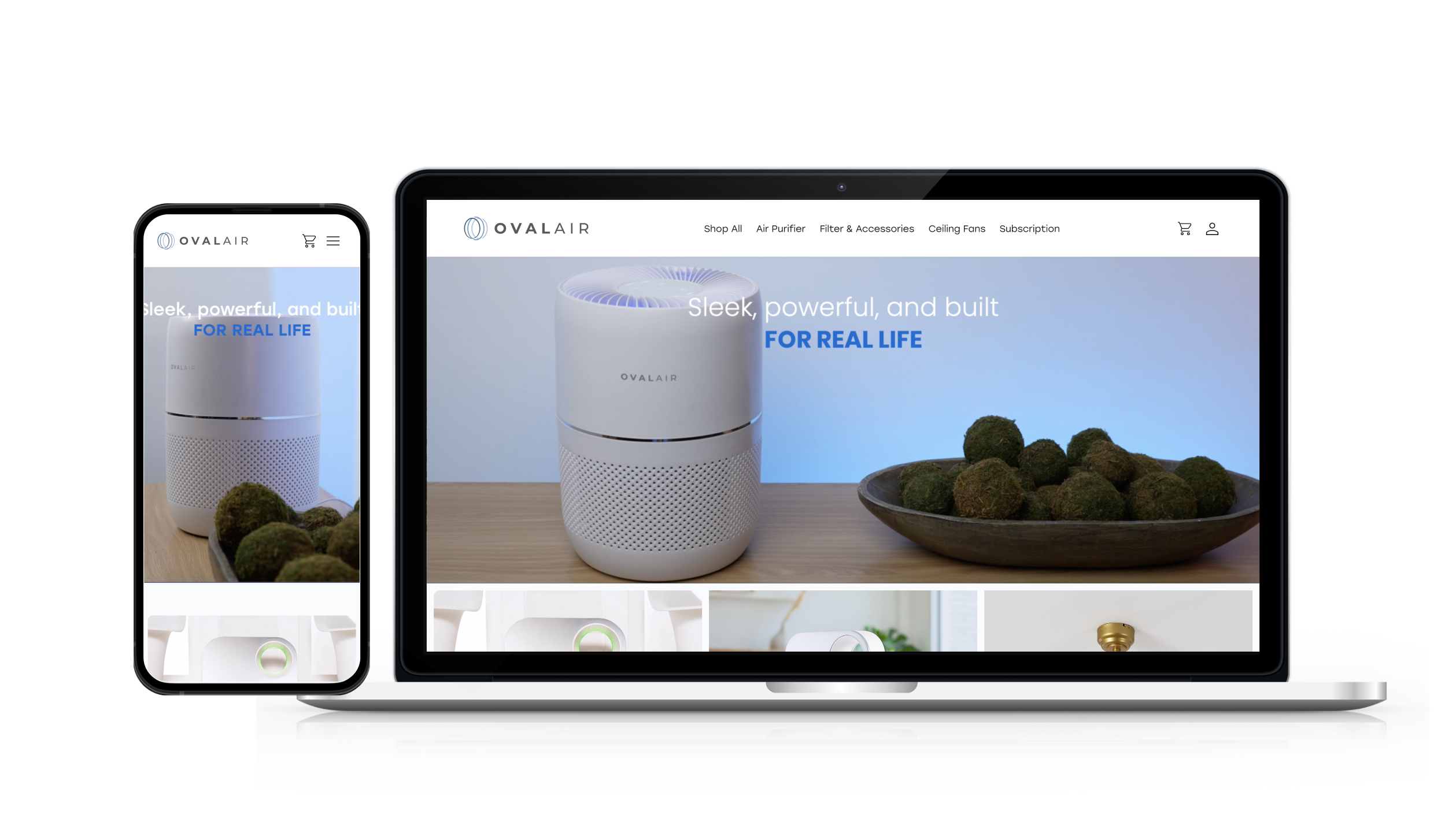
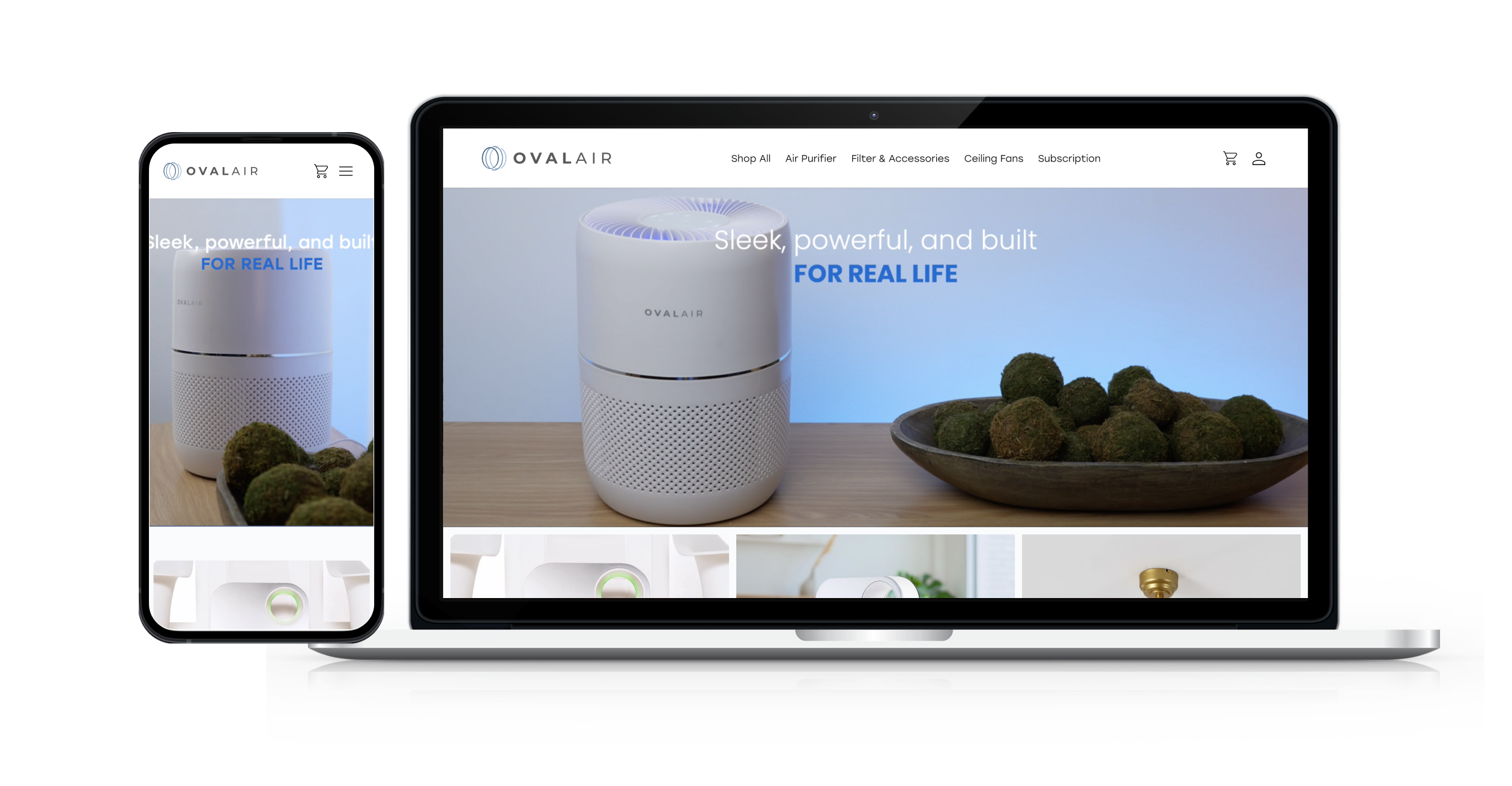
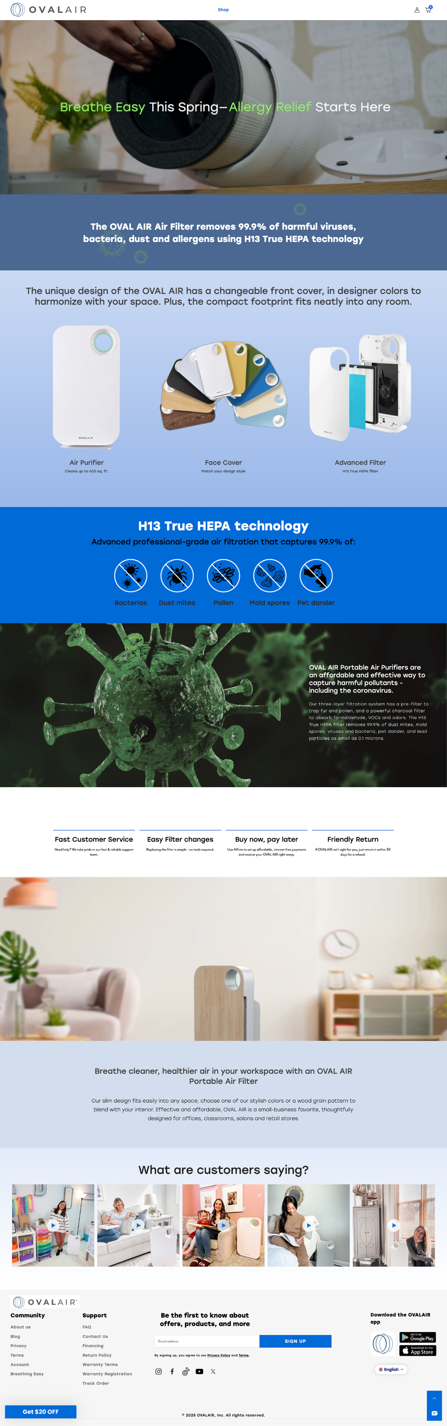
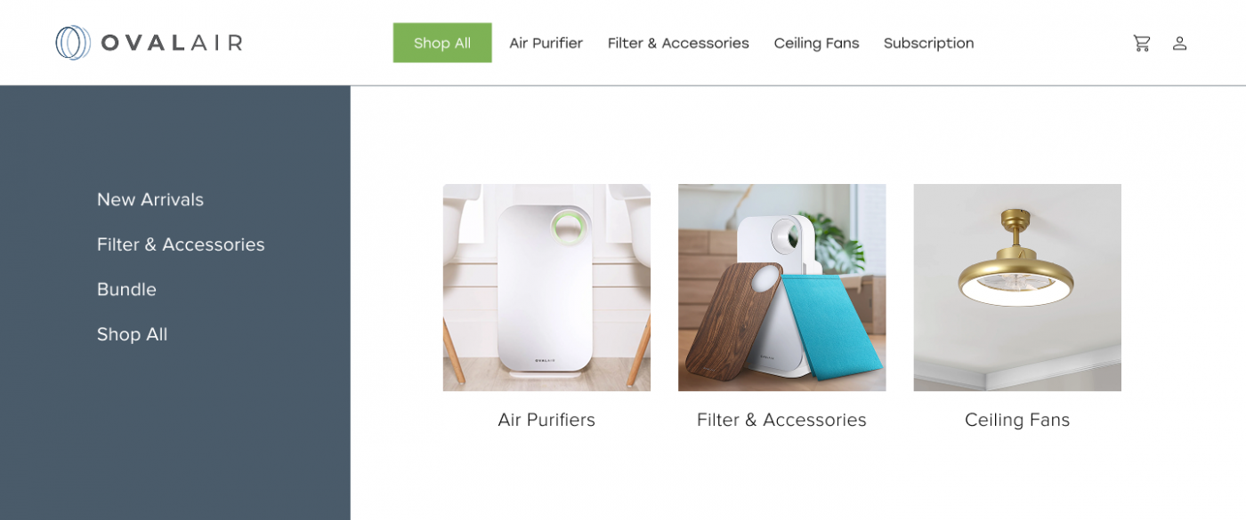
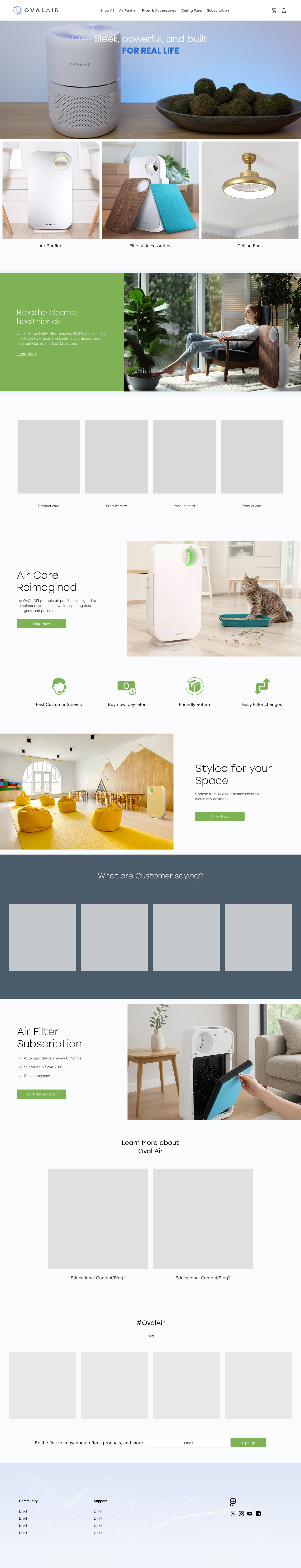
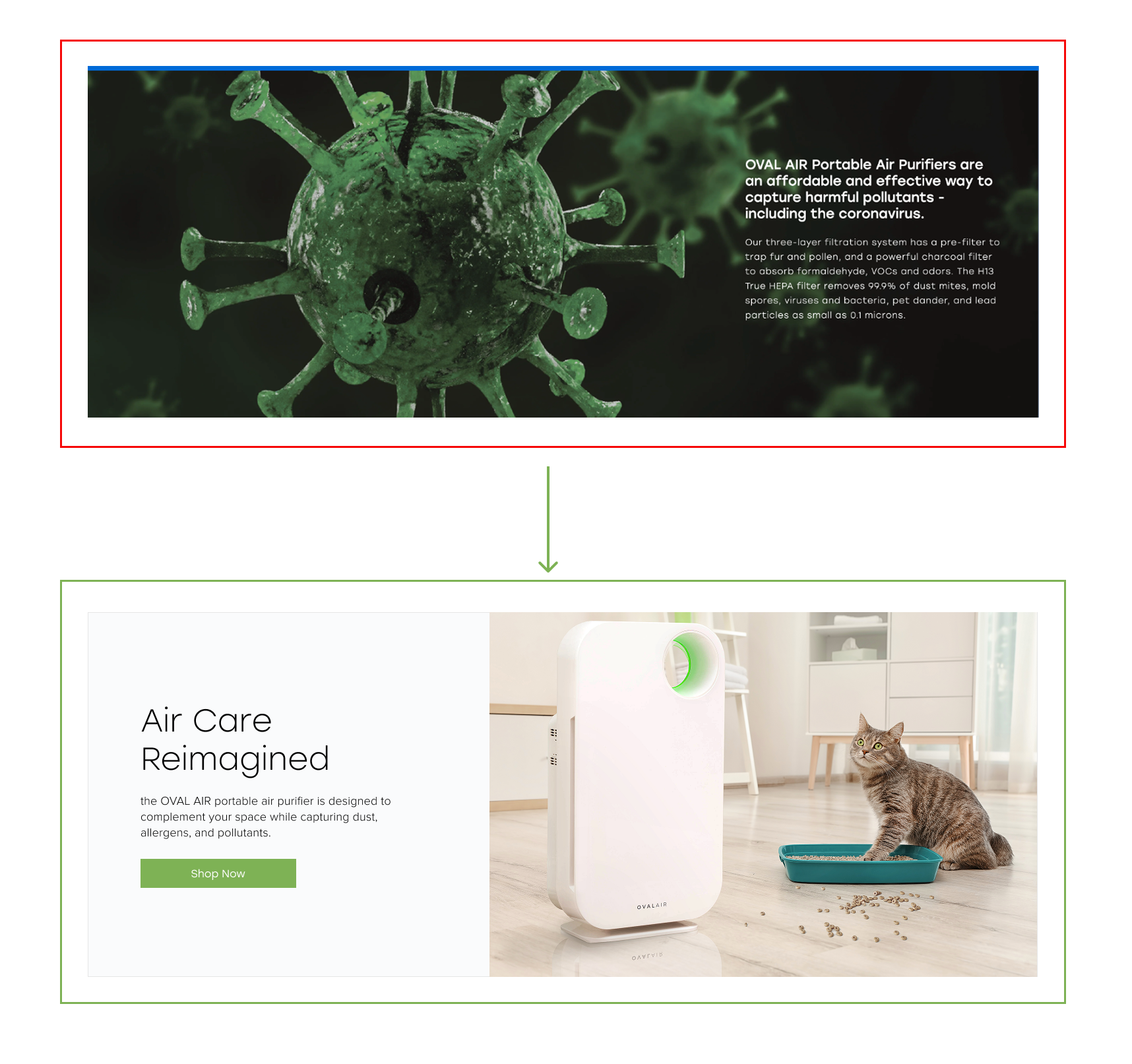
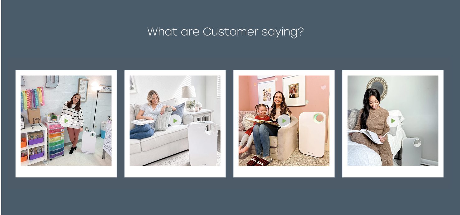
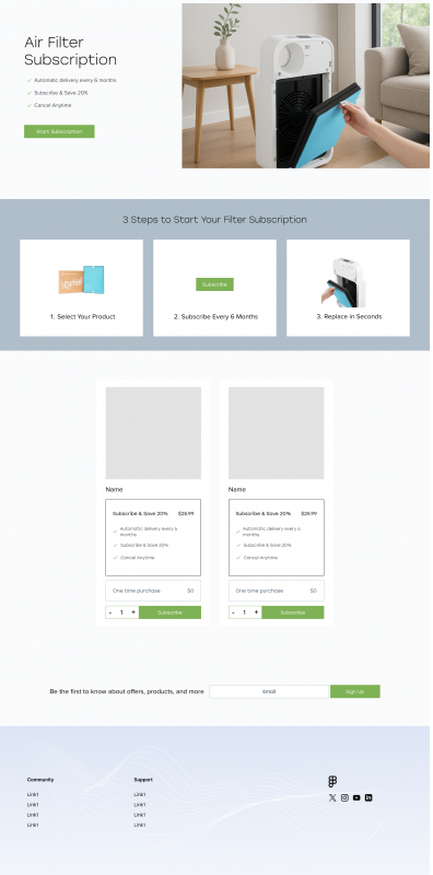
Oval Air, a premium air purifier brand, had a content-heavy website that resembled a blog more than a shoppable experience. Despite strong product quality, the site lacked structure to drive purchases or build lasting customer relationships.

I led the redesign to transform Oval Air’s site into a conversion-focused eCommerce platform—bringing clarity to the product offering, introducing a subscription model, and building user trust through a refined UX/UI strategy.

Old Navigation & Homepage

New Navigation & Homepage

Problems

  • The site was content-rich but not optimized for shopping
  • Users couldn’t easily understand the product or how to buy it
  • There was no clear path to purchase or repeat engagement

My Strategy

To move quickly and effectively, I focused on 3 core pillars:

  • Make the Product Shoppable
    Shift the site from blog-style to a structured commerce experience with clear navigation, pricing, CTAs, and product education.
  • Build User Trust
    Use visual hierarchy, testimonials, certifications, and product benefits to give users confidence in their purchase.

  • Create Recurring Revenue
    Introduce a Subscription Page to let users auto-order replacement filters—driving retention and convenience.

Week-by-Week Breakdown

Week 1: Audit & Planning

  • Assessed the existing site and identified friction points
  • Met with the category manager to clarify user needs and business goals
  • Prioritized key pages and outlined content structure
  • Collaborated with the developer early to align on feasibility

Week 2: Wireframes & Collaboration

  • Created wireframes in Figma focusing on the homepage, product detail page, and subscription experience
  • Aligned weekly with the category manager to refine content strategy

Week 3: High-Fidelity Design & Delivery

  • Finalized UI design using Figma’s component libraries for scalability
  • Designed and delivered:
    • Homepage (with product intro and social proof)
    • Product Page (clean specs, benefits, trust markers)
    • Subscription Page (plan options, clear CTA, flexible setup)
    • About/Brand Section (to educate and support trust)


  • Worked closely with the developer for implementation handoff
  • Due to time constraints, we paused formal user testing and planned for post-launch iteration

Result

  • A fully redesigned website aligned with commerce goals
  • Clear, guided shopping flow that reduced friction
  • Subscription model introduced as a long-term engagement tool
  • A solid design foundation for the upcoming product launch

Key Learnings 

  • A content-rich site must still guide users clearly to action—especially in eCommerce
  • Involving developers early saved time and reduced friction
  • Strategic layout and Figma collaboration ensured a fast and smooth delivery under tight deadlines
  • Trust-building is just as important as conversion—especially for health-focused products